
Rock to Recovery Benefit Concert
Rock to Recovery is a yearly benefit concert to help raise awareness and funds for guidance of participants becoming empowered to release their feelings into music they create - via songwriting, group performance, and recording they create bands with the participants, and each band creates its own song directly from their hearts. For this project we started with three theme ideas that funneled into one clear vision for the concert advertising and branding. Those three themes can be seen below.
Theme 1
From talking with the organizers of Rock to Recovery, for theme 1 I decided to aim for a punk rock vibe with heavy emphasis on old rock posters. I leaned into dot patterns for the main imagery with a grungy border as well as texture you would find on a poster. For the works I chose to have a very grungy healing typeface paired with a more readable secondary font for smaller copy. Lightning bolts, and bursts along with extended shadows allowed me to not have to worry about contrast between the text and any background color. was for the colors themselves I wanted to focus on warmer tones that I felt fit the punk rock vibe. This theme was chosen in the end and for the final round we changed the colors to be CMYK to “pop” more on social media.


Theme 2
For theme 2 I focused on a tattoo parlor vibe and utilizing the wings that are also in the Rock to Recovery logomark. I focused on a bursting background of blue and red paired with a foreground frame that would contain all of the information. This was a cleaner theme without a lot of the grunge from the first these but had big bold text that would draw the viewer in. For added Depth a halftone circular dot pattern sits in-between the foreground and background. If any imagery was used, a gradient map using the background blue and red colors would be used to bring any photography into the same realm as the rest of the theme.


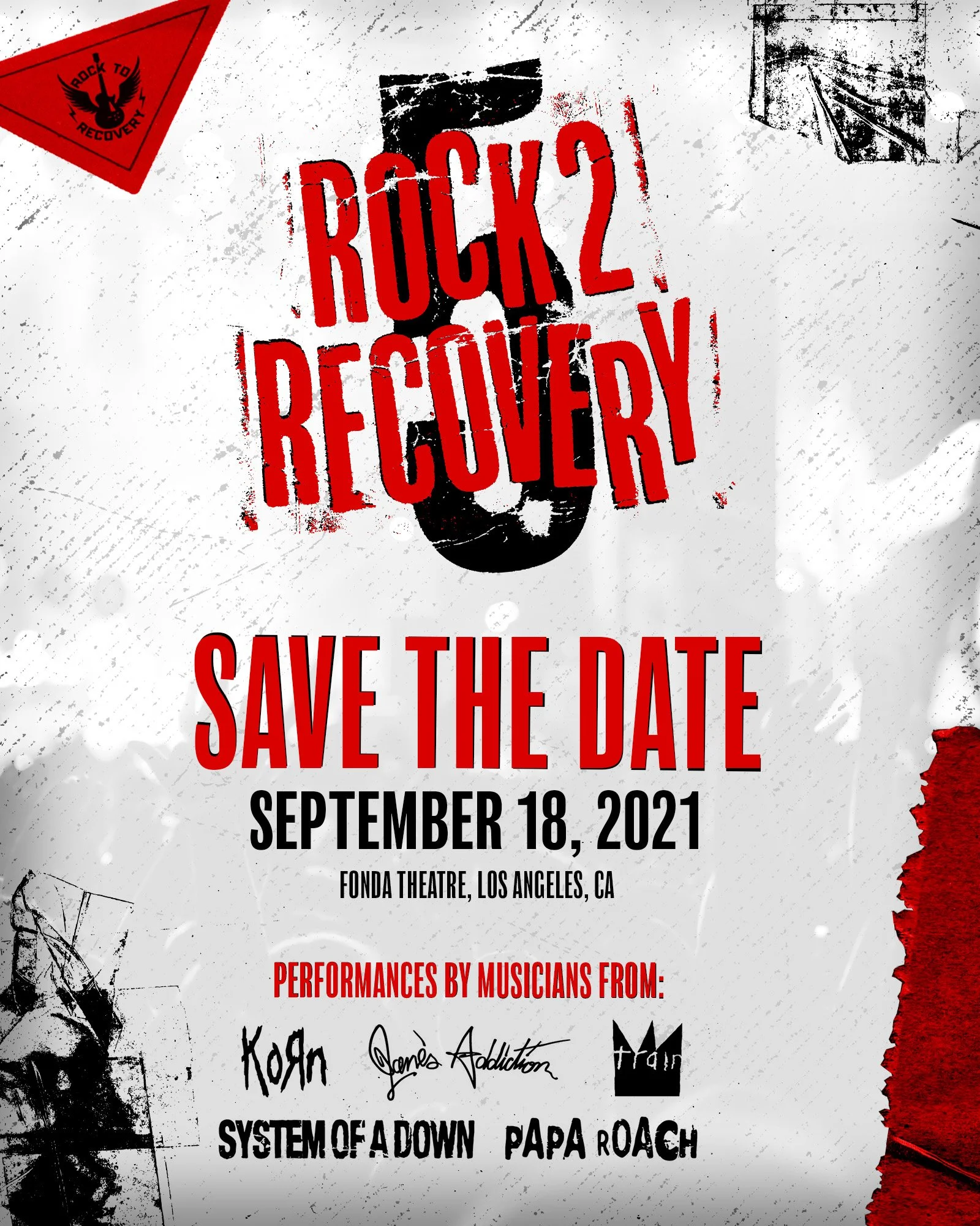
Theme 3
The third theme brings back in some of the grunge elements and introduces some tape and paper textures. These are mainly used for border elements to add contrast to and piece. The Logos would be contain within a triangle sticker to continue the grungy paper theme. Red, Black, and White are all used to reflect how big and bold “rock n roll” can be. The Rock 2 Recovery word mark uses a rough typeface overlayed on the number that could theoretically be changed yearly. A grunge texture overlays the whole design to tie everything together.


Final Theme
In the end we chose the first theme with a slight tweak of the colors. We changed the red and orange to a CMYK color palate. This still fit in with the punk rock vibe and the client loved how it looked with these colors. I ended up creating, social media assets, digital and print advertisements, motion graphics, signage at the event, and other promotional posts using this final theme which can all be seen below.


